 Custom Shaped







 Clear Acrylic



What Makes a Sign Eye-Catching? Top Design Tips from Our Team
You’ve got just a few seconds, maybe even less, to grab someone’s attention with your signage. Whether it’s a shopfront sign on a busy high street or a freestanding totem at a retail park, your sign needs to work hard. But what exactly makes a sign eye-catching?
It’s not just about bold colours or massive letters (although those help). A truly effective sign is a combination of smart design, brand consistency, and practical thinking. At Benson Signs, we’ve been helping businesses turn heads with custom signage for over 55 years. In that time, we’ve learned a thing or two about what works.
Here are our top tips for creating signage that stops people in their tracks for all the right reasons.
1. Start with a Clear Message
Before you dive into colours, fonts or shapes, think about what your sign needs to say. The most effective signage is built around a clear, simple message that people can absorb at a glance.
- For a shop fascia, that might just be your logo and trading hours.
- For a vehicle graphic, it could be your service, phone number, and website.
- For a totem or directional sign, it might just be your business name and location arrow.
Tip: Keep your core message to 5–7 words. Less is more when people are reading on the move.
2. Use Contrast to Your Advantage
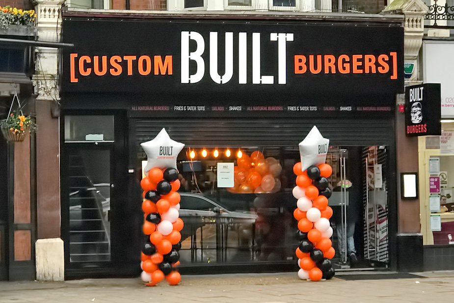
An eye-catching sign stands out from its surroundings, and contrast plays a big role in that. Whether it’s light text on a dark background or bold graphics against a plain surface, contrast helps your sign stay visible from a distance.
Some tried-and-tested combinations include:
- White text on navy
- Black on yellow (great for safety or industrial signs)
- Red on white (attention-grabbing but still readable)
Be careful not to use colours that are too similar in tone, especially for smaller signs. They’ll blur together and be hard to read.
High contrast also improves visibility for people with visual impairments, helping you stay inclusive and accessible.
3. Choose Readable Fonts
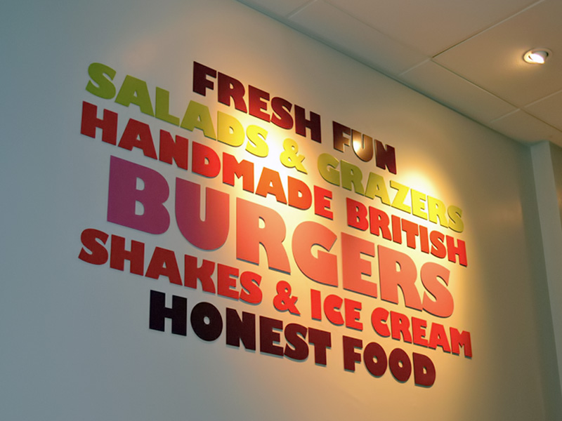
It might be tempting to use a trendy script font or something super stylised, but readability should always come first. The best fonts for signage are:
- Bold and simple
- Sans-serif (like Helvetica, Arial, or Futura)
- Consistent in spacing and weight
Make sure your text isn’t too tightly spaced or stretched, and test how it looks from a distance. A sign that looks great on screen might be completely unreadable on a wall 10 metres away.
Tip: Use a maximum of two fonts on one sign. Too many styles can feel cluttered and confusing.
4. Use Branding, But Use It Well
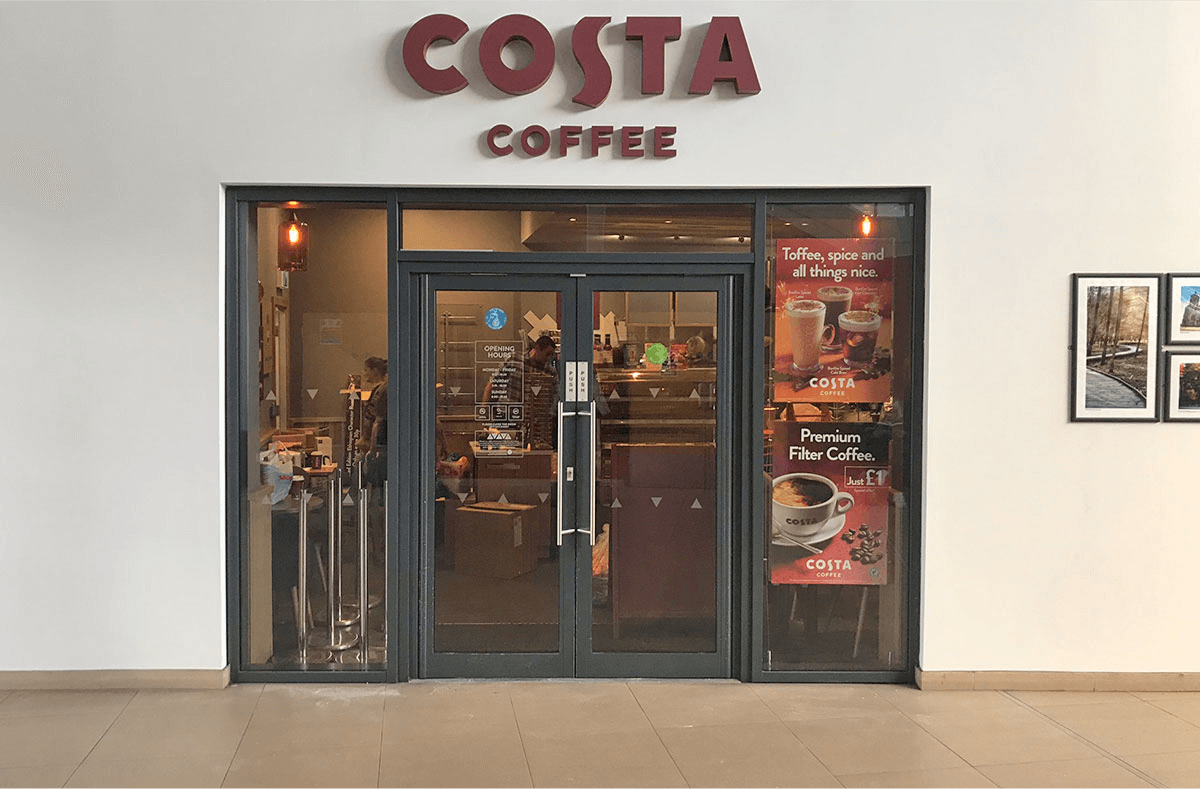
Your signage should be an extension of your brand, not an afterthought. That means incorporating your brand colours, fonts, and logo in a way that feels natural and intentional.
This helps reinforce brand recognition, especially if your business also advertises online, on social media, or through printed materials. Consistent signage strengthens your identity and builds trust.
Examples of great branding in signage include:
- A logo sign with your exact brand colours and shape
- A reception sign matching your business cards or website
- Window graphics that mirror your online marketing design
Pro tip: Even subtle branded touches (like a colour-matched sign tray or etched logo) can go a long way.
5. Think About Size and Scale
Size matters when it comes to signage, but bigger isn’t always better. What matters more is appropriate scale for your location and how people interact with the sign.
Ask yourself:
- Will people see this from the road, or on foot?
- How far away will they be standing when reading it?
- Are there trees, buildings, or other signs that might block it?
A fascia sign on a busy high street might need large lettering and lighting. A window graphic in a small boutique can be more delicate and detailed. A good signage company will always help guide you on scale during the design process.
6. Add Depth and Dimension
Flat signs work well in lots of spaces, but adding some depth can really make your sign pop. 3D elements like built-up letters, layered logos, or shaped panels catch the light differently and create visual interest.
Illumination also adds dimension with options like:
- Halo-lit letters for a glowing effect
- Backlit trays for modern retail signage
- Projecting signs that extend out from your building
These elements make your sign more dynamic and attention-grabbing, especially in crowded or high-traffic environments.
7. Location
Even the best-designed sign won’t work if it’s in the wrong place. Think about natural sightlines and traffic flow when deciding where to place your sign.
Key things to consider:
- Height – Make sure it’s visible at eye level (or above, for distance)
- Obstacles – Avoid positioning behind poles, trees, or other signs
- Lighting – If the area is dark, consider built-in illumination or external lighting
Tip: For wayfinding or directional signs, consistent placement is key, so people can spot them without having to look around.
8. Keep It Clean (In Design and Maintenance)
A cluttered design will always lose out to a clean, simple layout. Make sure there’s enough white space around your text and elements so nothing feels cramped.
And once your sign is up keep it clean in the literal sense too! Dirt, rust, and peeling vinyl can all make even the most beautiful sign look tired. Regular maintenance (especially for outdoor signs) will help keep your brand looking sharp.
Good Design is the Difference Between Being Seen and Being Ignored
At the end of the day, an eye-catching sign isn’t just about looking good, it’s about doing its job. Whether that’s getting someone to walk through your door, remember your name, or find their way around your site, your signage needs to work hard for your business.
The good news? You don’t have to figure it all out on your own.
At Benson Signs, we design and manufacture signage that’s not just functional but visually striking, brand-consistent, and built to last. Our in-house design team knows exactly how to turn your ideas into signs that get noticed.Need help creating signage that stands out for the right reasons? Get in touch. We’re always happy to offer advice, design support, and a free quote.